Making sense of colour (in art)

A touch of blueI noticed how strongly I am drawn to the
colour of sky in these pictures. I like to find blue in limestone,
often there is grey which light can reflect a hue of differing 
colours. Colours are quite made up really, referential, it is said
we like green as a feeling of peace and yet the contrast is what 
really makes a colour. Green soon becomes brown or red as you 
break it apart to distinguish. A bright morning can be white, 
yellow or red and tones will take any colour that overthrows the 
pastel palete to generate crisp lines as your eyes wake up and
become accustomed or choose to reject a washed out appearance
in front of them. I suppose you could say that En Vau is not so
blue but like I was arguing then, it is in this case the colour 
that allows me to like light limestone, to find it delicate and 
full of features to tease out, a companion colour sometimes washed
in. 
Aberdovy
North Wales
The Castle
Cassis drop
Cap Canaille
Cap Canaille, over the sound
En Vau
En vau, again looking down
Yellow is much harder to see but I like it alot, perhaps it is rock
that has it the most. in limestone it will be a dirty colour
signalling uneveness and therefore broken down and loose, to a 
climber dangerous terrain. Yet I made the whole slope yellow as light
colours can change fast in appearance as you focus on shape and form.
This is where the favorites live, gentle persuaders, pastels who don't 
know what they are until shape lines and features reveal what they
could be from a distance or another.

About/Home-Bright Calm Illustrations
Wales
Local

Mannequin outfit

Striking colours, to make a bold statement where a light dress is quite heavy on the eye. Where relaxation just won’t settle down, natural meets functional action clothing. What do you think? Correct description.

valentine MODELS

I mend clothes but have got a bit behind on it due to alot of priorities making me feel it’s high time to get out and buy new or charity shop new. It must have been time costly and part of the excessive self sufficiency lifestyle. Heck it makes you impossible to hang with so I have invented a model to chill out with and focus on one of my many areas for catch-up. An active attractive one.

I think this suits the different adaptations of colour schemes including the charcoal/ off black tones. As the actual model is boy scrawny. Really my mind must be distracted on the woman, but I believe it is a good clothing design. I like to see men dressed well too, not fond of samey clothes that are intentionally square. She is best unashamed as a strong spirit for me like he once was in a similar dress believe it or not, so it is with wearing the trousers or dress.

Further art themes at

Brightcalmillustrations

Art 2018 passed portraits continue. Valentine.

I can be blamed for not adding a description to work but have not really worked out links and such so have been personally taken by the process rather than able to plan. I still don’t understand the menu of wordpress or why it is set to have a header from a default I cannot find but here goes.

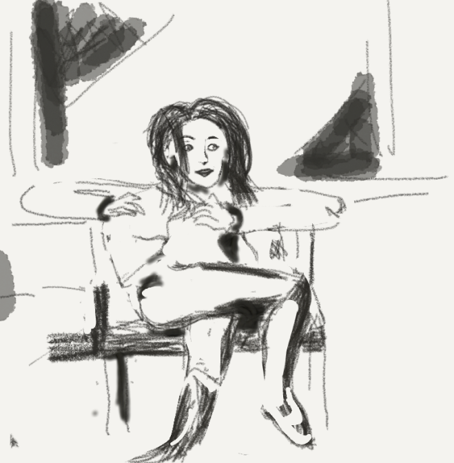
Picture – (Tablet) Valentine. It’s that time of year as soon as you feel it approaching. No valentine, just draw one. She is worthy of approaching but it is the distance of a common room and a casual pose, briefly at ease and light spirited. I know her as interesting and interventionist, not shy nor slow to take out her diary either. It would be full but it’s nice to celibrate Valentines day just by admiring someone who witnessed your life. Actually from last year, 2018.

I did get accepted as valentine but just for the moment, so this was a rumination on the theme of the need to find another a few weeks later. I more or less have been dateless for all of 20 years until then. I hope to find art as my annual way of taking part as it is a shame to miss the opportunity if it falls through again.

valentine.png


Soon to be added to brightcalmillustrations art portfolio.


About/Home-Bright Calm Illustrations

Back to top